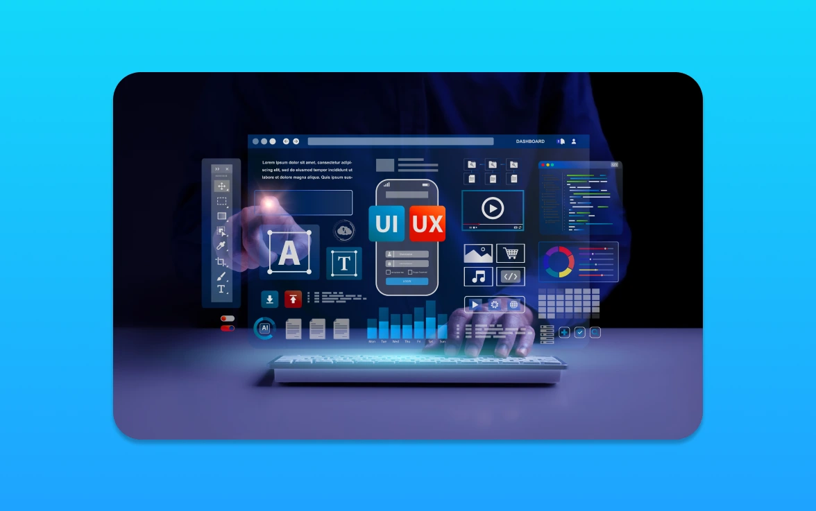
As we will enter 2026, I’m thrilled to share the latest changes in website design. These changes put users at the forefront. They aim to create smarter, more inclusive, and adaptable sites.
We’re moving away from just looking for the next big thing. Now, we focus on making websites faster, smarter, and more human. This means making sure websites are easy to use and respond well to what users do.
Let’s dive into the trends that are changing how we use the internet. With a focus on user-centric experiences, we’re helping businesses thrive online.
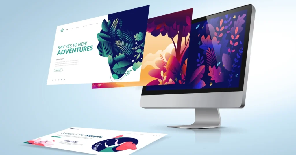
The Rise of Minimalist Design
In 2026, minimalist design will be more popular than ever. It’s all about keeping things simple and easy to use. With more people using different devices to access websites, a clean design is key.
Simplicity in Design
Minimalist design means removing what’s not needed to show off a clean look. This makes websites look good and work better. It makes it easier for users to find what they need.
Designers aim for simplicity to make websites both beautiful and useful. This improves how users feel when they visit the site.
Impact on User Experience
Minimalist design has many benefits for users. It makes websites work well on phones and tablets. It also makes websites more engaging by cutting down on clutter.
Also, a minimalist design works well on all devices. This means users have a consistent experience no matter where they are.
Sustainability in Web Design
Environmental issues are becoming more pressing, making sustainable web design vital. Businesses must focus on their online presence and its environmental impact. This is key for a greener digital footprint.
Eco-Friendly Hosting Options
Choosing eco-friendly web hosting is a simple step towards sustainability. These services use renewable energy like wind or solar. Look for hosts that are open about their energy use and commitment to the planet.
This choice not only cuts down your website’s carbon footprint. It also boosts your brand’s eco-friendly image.
Here are some eco-friendly hosting options:
- GreenGeeks: They use renewable energy credits to offset their energy use.
- InMotion Hosting: They offer various hosting plans and work to reduce their environmental impact.
Sustainable Design Practices
Website design also plays a big role in sustainability. Sustainable design makes websites look good and use less energy. This is done by optimizing images, cutting down code, and using dark mode.
- Optimizing Images: Smaller images mean less data transfer, which saves energy.
- Minimizing Code: Less code means less energy needed to load and run websites.
- Dark Mode: It saves energy on devices with OLED screens, as black pixels use less power.
By using these sustainable design practices, businesses can improve their online presence. They also show they care about the environment. This is essential for effective web development and SEO-friendly websites.
The Advancement of AI in Web Design
AI is changing web design by making it more personal and automated. This change is not just about new tech. It’s about making websites more engaging and easy to use.
Enhancing User Experience with AI
AI’s biggest leap is in personalising user experiences. It uses data to create experiences that fit each user’s needs. This boosts engagement and sales.
Here are some key benefits of AI-driven personalisation:
- Improved user engagement through relevant content
- Enhanced customer satisfaction by meeting individual needs
- Increased conversion rates due to personalised recommendations
Streamlining Design with Automated Tools
AI is also changing the design process with automated tools. These tools help with layout, colours, and content, letting designers focus on creativity.
Some benefits of automated design tools include:
- Reduced design time due to automated tasks
- Consistency in design elements across the website
- The ability to quickly test and iterate on different design variations
By using AI in web design, businesses can make websites that are more dynamic and user-friendly. This leads to growth and success.
Mobile-First Design Strategies
In today’s digital world, making your website mobile-friendly is essential. Most people use their phones to browse the internet. So, designing for mobile first is key to a good user experience.
Let’s look at how to make your website mobile-friendly. First, we need to understand responsive design. This lets your website change to fit different screens and devices.
Responsive Design Principles
Responsive design uses a flexible grid system. It adjusts to various screen sizes, making your website look good on all devices. Instead of fixed sizes like pixels, use relative units like percentages or ems.
This makes your website’s layout flexible. It can handle different screen sizes, orientations, and devices. For example, a desktop menu can turn into a mobile menu, making it easier to use.
Importance of Fast Loading Times
Fast loading times are vital for a mobile-friendly website. A slow site can cause people to leave quickly. This can hurt your search rankings.
To speed up your site, optimise images and minify CSS and JavaScript files. Also, use a content delivery network (CDN) to make pages load faster. Fast loading times improve user experience, increase conversions, and boost your online presence.
In summary, mobile-first design is critical for businesses in the digital world. Focus on responsive design and fast loading times. This will create a smooth user experience that boosts engagement and conversions.
Expanded Use of 3D and Immersive Elements
Web design is changing fast with 3D and immersive elements. Technology is making websites more engaging and interactive. This shift is exciting for both users and businesses.
Enhancing User Engagement
3D graphics and animations grab users’ attention. They make websites more interactive. This encourages users to explore more, making their experience memorable.
Here’s how these elements can be used well:
- Interactive 3D models show products in a fun way.
- Immersive stories create an emotional bond with users.
- 3D animations help users navigate websites better.
Tools for Creating 3D Experiences
Many tools help make 3D and immersive web experiences. Some top ones are:
- Blender: A free tool for 3D creation, including modelling and animation.
- Three.js: A JavaScript library for 3D graphics in the browser.
- Adobe Substance: A suite for managing 3D assets and materials.
With these tools, web designers can make stunning 3D experiences. These experiences draw in users and make websites stand out.
Inclusive and Accessible Design
Accessibility is now a key part of web design. It’s important to make websites for everyone, including those with disabilities. This makes websites better for everyone and helps more people use them.
Understanding Accessibility Standards
Accessibility standards guide us in making websites for all. The Web Content Accessibility Guidelines (WCAG) 2.1 are key. They help us create websites that everyone can use.
Following these guidelines means our websites are easy to use. We make sure they are clear, easy to navigate, and work well with assistive technology. This includes clear navigation and text for images.
Tools for Testing Accessibility
Testing tools are vital for checking if a website is accessible. Tools like WAVE, Lighthouse, and axe DevTools help find problems. They give tips on how to make websites better.
Here’s a quick look at some tools:
– WAVE shows how accessible a page is.
– Lighthouse helps improve web pages, including making them more accessible.
– axe DevTools finds and fixes accessibility issues.
Using these tools and following accessibility standards makes websites better. It helps people with disabilities and makes the internet more welcoming for everyone.
Motion Graphics and Animation
Let’s look at how motion graphics and animation will change web design in 2026. They will make websites more engaging and visually appealing. Dynamic elements are key to grabbing users’ attention and guiding them.
Enhancing User Experience with Animation
Motion graphics and animation bring many benefits to web design. They make interactions smoother and more fun. For example, animations can show users what to do next on a website.
Using motion graphics wisely can also make a website look better. It becomes more memorable and fun for visitors. Subtle animations can make the experience more dynamic and engaging.
Best Practices for Motion Graphics
To get the most out of motion graphics and animation, follow these best practices:
- Use animations to help users and highlight important parts.
- Keep animations simple and avoid overwhelming the user.
- Make sure animations work well on all devices and browsers.
- Test animations on different platforms for consistency.
By using motion graphics and animation wisely, web designers can make websites more engaging and memorable.
Voice User Interface Design
The rise of voice-activated devices is changing how we use digital products. Voice User Interface (VUI) design is now key to a good user experience. As we use voice commands more, we need to think about how this affects web design.
The Rise of Voice-Activated Devices
Devices like smart speakers and virtual assistants are getting more popular. This move to voice-driven interactions is changing how we design for users. Designers must now adapt to this new way of interacting.
More people are using voice commands, which means web design needs to change. The need for smooth voice interactions is growing. Designers face both opportunities and challenges in making voice UI intuitive and conversational.
Designing for Voice Interactions
Designing for voice is different from traditional visual design. Conversational design is central to VUI, aiming for simple, voice-driven experiences. Designers must understand human conversation and voice command limits.
When designing for voice UI, clarity and simplicity are key. Designers should make voice commands clear and direct. This makes experiences more intuitive and user-friendly, using the benefits of voice-activated devices.
Exploring VUI design shows conversational design’s importance in shaping user experience’s future. By diving into this new area, designers can make digital products more engaging, accessible, and user-friendly.
Advanced Typography Trends
Advanced typography is key in web design, making sites better and brands more recognisable. It’s clear that typography shapes a brand’s online look.
Custom Fonts and Brand Identity
Custom fonts help make a brand stand out. By choosing unique fonts, businesses can be different from others. This makes a strong impression on their audience.
Custom fonts let brands match their typography to their needs. This ensures their message is clear on all digital platforms.
Readability on Different Devices
Readability on various devices is vital today. With more people using mobiles, text needs to be clear on small screens too.
Designers use responsive typography to solve this. Techniques like variable fonts and fluid typography keep text clear on all devices.
Integration of Augmented Reality
Augmented reality is changing how we use websites, making them more immersive. It’s not just a fun feature; it’s a big step forward in web design.
Adding AR to websites makes them more engaging. It lets businesses connect with their audience in new ways. Let’s look at how AR changes web design for the better.
Practical Applications of AR
AR has many uses in different fields. In shopping, it lets people try out products online, saving time and effort. For example, you can see how furniture fits in your home or try on clothes virtually.
In schools, AR makes learning fun and interactive. Students can explore historical sites, see complex ideas in 3D, or work in virtual labs. It makes studying more enjoyable and effective.
How AR Enhances Web Design
AR makes websites more interactive and engaging. It lets designers create experiences that go beyond simple screens. This way, businesses can stand out and make a strong impression.
Also, AR helps show information in new ways. It turns complex data into 3D visuals, making it easier to understand. This boosts the website’s effectiveness in sharing its message.
The Importance of Data-Driven Design
Data-driven design is key to the future of web design. It uses user feedback and analytics to make websites better. This way, businesses can create sites that really meet their users’ needs.
Understanding User Needs
It’s vital to listen to what users say about your website. This helps you know what to improve. You can then make smart design choices that work well.
Iterative Design for Continuous Improvement
Data-driven design is a continuous effort. By always checking analytics and user feedback, you can keep making your website better. Let’s use data to guide our design and make websites that truly add value.