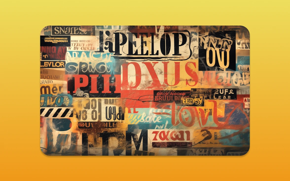
As we will enter 2026, typography is changing fast. It gives businesses a chance to make their brand stand out. The right fonts can really change how people see your brand.
New typography trends mix old and new styles. They focus on being real and using the latest tech. This helps businesses connect better with their customers.
Let’s see how these trends can help your brand look better and grow.
The Importance of Typography in Branding
In the world of branding, typography is key. It shapes how people see your brand. The fonts you pick show your brand’s tone, personality, and values. This makes typography a vital part of your branding strategy.
As a business owner, you know your brand’s identity is key to standing out. Typography is a vital part of this identity. It affects how people see your brand and the feelings it evokes.
How Fonts Influence Brand Perception
The font you choose greatly affects how your brand is seen. For example, serif fonts like Times New Roman suggest tradition and reliability. Sans serif fonts, like Open Sans, show modernity and cleanliness. Your brand’s image is shaped by the fonts you pick, so it’s important to choose wisely.
Studies show that typography can change how people see your brand’s professionalism, friendliness, and trustworthiness. A bold, statement font can make your brand seem confident and innovative. On the other hand, a more elegant, cursive font might suit a luxury brand aiming for sophistication.
Typography and Emotional Response
Typography also plays a big role in how your audience feels. Different fonts can make different emotions. For example, a playful, handwritten font can make your brand seem friendly and approachable. A stark, minimalist font can suggest simplicity and elegance.
Knowing how typography affects emotions lets you use it to create the right feelings. By picking fonts that connect with your audience, you can build a stronger bond with them. This can lead to more loyalty and engagement with your brand.
Emerging Font Styles for 2026
Typography trends for 2026 focus on minimalism and bold statements. Font styles play a key role in modern branding. The right font can make a business stand out in a busy digital world.
Simplicity in Design
Minimalist fonts are back, bringing a clean look. They are simple yet powerful, delivering the brand’s message clearly. These fonts improve readability and give a modern, professional feel.
Fonts like Open Sans and Montserrat are favourites for their clarity. When using minimalist fonts, think about your brand’s look and how it will appear everywhere.
Bold Expressions
Bold and statement fonts are also trending. They grab attention and are great for headings and titles. This adds emphasis and interest.
Fonts like Arial Black and Impact are popular for bold statements. But, it’s important to balance them with simpler fonts to avoid too much. Mixing bold fonts with minimalist designs creates a striking brand identity.
The Rise of Variable Fonts
Variable fonts are changing design by allowing one font file to change styles. This boosts brand identity and design flexibility.
This new type of font makes design easier. Designers can do more with less, keeping their work looking great. Let’s look at how variable fonts help in modern design.
Flexibility in Design
Variable fonts are great because they offer many styles in one file. Designers can try out different weights and widths easily. They don’t need to switch between many fonts.
For example, a brand can use one variable font for all their marketing. This means bold headlines and fine print can look consistent. It helps keep the brand’s look the same everywhere.
Performance Benefits of Variable Fonts
Variable fonts also make websites and apps load faster. They use fewer font files, making everything smaller. This means websites load quicker, improving how users feel.
This is good for businesses wanting to improve their online presence. Faster sites can keep users interested and increase sales. Variable fonts also help with responsive design, fitting well on all screens.
In short, variable fonts are changing design for the better. They offer creative freedom and technical benefits. As we use them more, we’ll see even more creative ways to use them.
Serif vs. Sans Serif: What’s Trending?
In the world of typography, serif and sans serif fonts are key. They are vital for businesses looking to improve their brand. As we look at 2026, knowing the difference between these fonts is essential.
Modern Takes on Classic Serif Fonts
Serif fonts are loved for their traditional look. They show sophistication and history. Designers are now making them more modern and versatile.
Fonts like Merriweather and Playfair Display are being updated. They now have cleaner lines and more defined serifs. This makes them great for both digital and print media. They add elegance to any brand.
Popular Sans Serif Choices for 2026
Sans serif fonts are also very popular. They are clean and simple. In 2026, they will be even more popular, with Montserrat and Inter at the forefront.
These fonts are easy to read on screens. They are perfect for businesses that value simplicity. Sans serif fonts work well in many places, like website headers and mobile apps.
Choosing between serif and sans serif fonts depends on the brand’s story. Knowing the trends and features of each helps businesses make better choices. This way, they can tell their story better and connect with their audience.
Colour and Typography: A Powerful Duo
Colour and typography are a strong visual tool. They can make a brand’s message and look better. This duo can really help with brand recognition and getting people’s attention.
Using colour in typography can make messages feel more real and clear. It’s not just about picking a colour that looks nice. It’s about knowing the feelings colours can bring up and how they match with different fonts.
The Psychology of Colour in Fonts
The way we see colour affects how we see fonts. Different colours can make us feel different things. For example, blue is often seen as trustworthy and stable, which is why it’s used a lot in corporate brands.
Red, on the other hand, can make us feel urgent or excited. It’s often used in ads to grab our attention.
Best Colour Combinations for Engagement
Choosing the right colours for your typography is key for keeping people interested. High contrast colours like black and white are great for being clear and easy to read. Complementary colours, like blue and orange, add interest. Analogous colours, like different shades of blue, create a smooth look.
- High contrast colours (e.g., black and white) for clarity and readability.
- Complementary colours (e.g., blue and orange) to create visual interest.
- Analogous colours (e.g., different shades of blue) for a harmonious look.
By knowing about colour psychology and picking the right colours, brands can make typography that’s not just pretty. It also connects with the audience in a meaningful way.
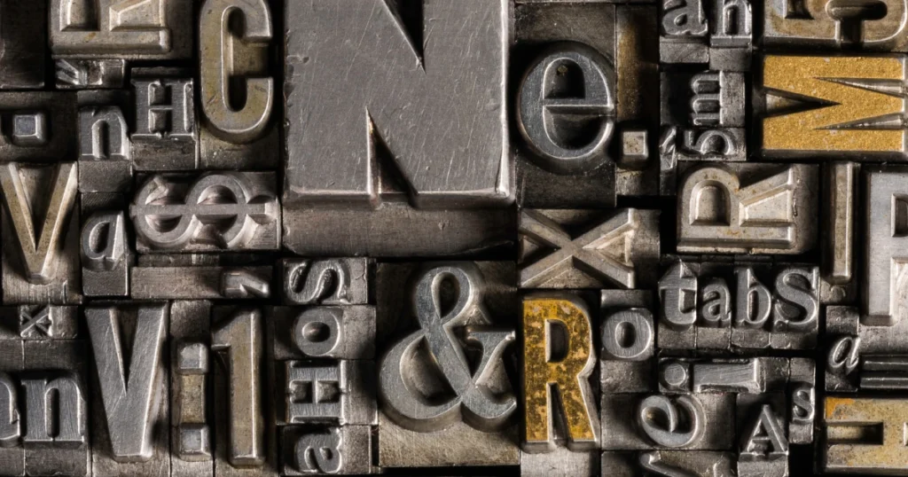
Custom Fonts: Standing Out in 2026
In 2026, it’s not just about having a great product or service. You need a unique look, starting with custom fonts. With so many businesses online, your typography is key to standing out.
Enhancing Brand Uniqueness
Custom fonts give your brand a special look that makes it stand out. This is vital in a world full of digital content. It helps grab and keep people’s attention.
Let’s look at why custom fonts are great:
- They give your brand a unique look
- They help people remember your brand
- You can choose a font that fits your brand’s personality
Investing in Custom Fonts: When and Why
Deciding to use custom fonts is a big choice. It should match your brand’s growth and marketing plans. For those looking to refresh their brand or create a strong identity, custom fonts are worth it.
Use custom fonts when:
- You’re changing your brand or launching something new
- You want to be noticed in a busy market
- Your brand needs a special tone and personality
Knowing the benefits and when to use custom fonts helps businesses. It boosts their brand’s look and how well it connects with people.
The Role of Typography in Web Design
In the digital world, typography is key in web design. It’s not just about picking nice fonts. It’s a vital part that shapes how users see your site.
Impact on User Experience
Your website’s typography affects how people see your brand and interact with your content. Good typography makes reading easier, guides the user’s eye, and can even stir emotions. Here are a few important points:
- Readability: Typography’s main goal is to make text easy to read. Fonts that are too fancy or too small can push users away.
- Visual Hierarchy: It helps create a visual order, pointing users to the most critical parts of the page.
- Emotional Connection: Different fonts can create different feelings, matching or clashing with your brand’s message.
Responsive Typography: Adapting to Devices
With so many devices out there, from phones to computers, responsive typography is essential. It makes sure your text is clear and looks good on any device. It’s not just about changing font sizes; it’s about making reading smooth on any screen.
To get responsive typography right, try these tips:
- Use relative units: Like em or rem, to let font sizes adjust based on the screen size.
- Media queries: Change font sizes with the screen size to keep reading easy.
- Line height and spacing: Adjust these to help reading on smaller screens.
By paying attention to these details, you can greatly improve your website’s user experience. It will become more engaging and easy to use.
Trends in Handwritten and Script Fonts
In 2026, handwritten and script fonts are back in brand marketing. People want authenticity and a personal touch in branding. These fonts provide that. Let’s look at the trends and how to use them in your brand.
The Appeal of Authenticity
Handwritten and script fonts add warmth and humanity to branding. They show uniqueness and personality, making a brand relatable. In a digital world, their personal touch is very effective.
These fonts are great for marketing that aims to connect emotionally. For example, a brand might use a handwritten font in their logo or ads. This makes the brand seem more friendly and approachable.
When to Use Cursive Fonts
Cursive or script fonts are versatile. They work well in logos, headings, and sometimes body text. But, use them wisely. They’re best for:
- Logos and brand names for a lasting impression
- Headings and titles for elegance
- Marketing materials for a personal touch
When using cursive fonts, think about your brand’s look and message. Make sure the font is easy to read and fits your brand’s tone and identity.
Accessibility in Typography
Typography can be both beautiful and accessible. In the world of branding creative, understanding accessibility is key. It’s not just a feature, but a must for clear communication.
Importance of Readability
Readability is key for accessibility. Easy-to-read content makes sure everyone gets your message. To make your content readable, consider these tips:
- Choose fonts with clear letterforms and adequate spacing.
- Avoid overly decorative fonts that can be difficult to decipher.
- Ensure sufficient contrast between your text and background.
Font Choices for Inclusive Design
Choosing inclusive fonts is a big step towards accessible typography. Pick fonts that are easy to read. Open Sans, Lato, and Merriweather are great choices. They look good and are easy to read on different devices.
Think about your content’s purpose and where people will see it. For screens, sans-serif fonts work best because they’re clear.
The Impact of Cultural Trends on Typography
In 2026, cultural trends are shaping font design and branding. Typography greatly affects how a brand is seen by its audience.
Global Influences in Font Design
Globalisation has mixed cultures in font design. Designers use inspiration from around the world to create unique fonts. This mix of old and new styles is popular.
Here’s how global influences affect font design:
– Using elements from different cultures makes a brand seem more welcoming.
– Unique fonts help a brand stand out in a busy market.
– It’s important to be careful not to offend with cultural choices.
Cultural Sensitivity and Typography
When designing for a global audience, cultural sensitivity is key. What’s stylish in one culture might be seen as wrong in another. Knowing the cultural background of fonts is vital for businesses aiming to go global.
To handle cultural differences well, businesses should:
– Learn about their audience’s cultural likes and dislikes.
– Work with local experts to make sure their branding fits.
– Be ready to change their branding as they enter new markets.
By understanding cultural trends and their effect on typography, businesses can connect with people all over the world.
Future Predictions for Typography
Looking ahead, typography’s future is bright, thanks to tech and new branding ideas. The world of typography is changing fast. This is because businesses want to be noticed more in the digital world.
Beyond 2026: Emerging Trends
Several trends are set to shape typography’s future. Artificial intelligence will play a big role in making fonts more personal. Also, augmented reality (AR) and virtual reality (VR) will need special fonts for better experiences.
Accessibility in typography is becoming more important. As digital content grows, fonts need to be clear for everyone. This means fonts will focus more on being easy to read and understand.
The Technological Backbone of Font Innovation
Technology is key in changing typography. New font tech, like variable fonts, is already changing digital design. AI and machine learning will make font design even more flexible and user-friendly.
New display tech and devices will also shape typography. Fonts will need to work well on different screens and sizes. This ensures that typography stays effective and engaging everywhere.
Practical Tips for Choosing the Right Font
Choosing the right font for your brand is key. It can greatly affect your brand’s look and feel. Here are some tips to help you pick a font that fits your brand’s style and message.
Aligning with Brand Identity
Think about how the font shows your brand’s personality and values. For example, a tech startup might use a modern sans-serif font like Open Sans. On the other hand, a luxury brand might prefer a sophisticated serif font like Didot. Make sure the font matches your audience and looks good with your brand’s visual identity.
Balancing Aesthetics and Functionality
A good font should look great and be easy to read. It should work well on different devices and platforms. Look at font size, line spacing, and contrast to ensure it’s both attractive and readable. For instance, Montserrat is great for digital screens because it’s easy to read and looks modern.
By thinking about these points, you can pick a font that boosts your brand’s image and helps meet your marketing aims.