
I’m thrilled to share the science of brand colour psychology with you. It’s key to growing your business online. Colour psychology greatly affects how people see brands and decide to buy.
Let’s dive into how colours shape consumer behaviour. Knowing this can help you improve your online ads. By grasping colour psychology, you can build a brand that truly connects with your audience.
Colour is a strong tool in shaping what people think of your brand. Used right, it can greatly enhance your online presence.
Understanding Colour Psychology in Marketing
Knowing how colours affect our feelings is vital for good branding. We need to understand colour psychology and its role in marketing.
What is Colour Psychology?
Colour psychology studies how colours affect our emotions and actions. In marketing, it looks at how colours shape what we think of a brand. Different colours can make us feel and act in various ways.
For example, the right colours can make a brand more recognisable and appealing. This is why colours are so important in social media marketing.
Importance of Colours in Branding
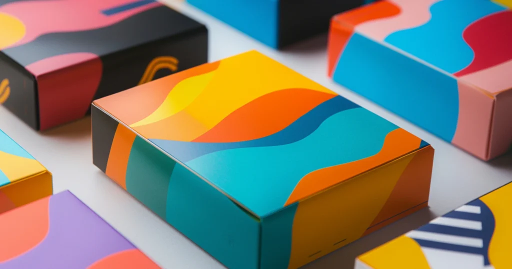
Colours are key in branding as they share a brand’s message and values. A consistent colour scheme makes a brand stand out and easier to remember.
Colours also shape how we see a brand in terms of trust and professionalism. Using colours wisely can also boost a brand’s online visibility, helping with search engine optimisation.
By applying colour psychology to branding, businesses can make a strong impact on their audience. Let’s use colours to improve our brand’s online presence and grow.
How Colours Influence Consumer Behaviour
Colours are key in shaping how people act towards brands. Knowing this can change your marketing game. In digital marketing, the colours you pick can really affect how people see your brand.
Emotional Responses to Colours
Different colours make people feel different things. Warm colours like red and orange make us feel excited and full of energy. Cool colours like blue and green make us feel calm and trustful. It’s important to know this to make marketing that really connects with people.
In content marketing, the right colours can make your content more engaging. Using colours that match your brand’s personality can make your content more relatable and shared. In email marketing, using colours wisely can grab attention and boost click-through rates.
Colour Preferences by Demographics
Colour preferences change a lot between different groups of people. Research shows that men and women see and feel colours differently. For example, a study by USC Online found men like bold colours, while women prefer softer ones.
Knowing these differences helps you tailor your colours to your audience. This makes your marketing more personal and engaging, leading to better results.
The Role of Colour in Brand Identity
A well-chosen colour scheme can make your brand stand out. It helps your brand be remembered and different in a busy market. Understanding how colour shapes your brand’s image is key.
Creating a Memorable Brand Image
Colour plays a big role in making first impressions. A study in Management Decision shows colours can influence up to 90% of our initial decisions. Let’s look at how to use colour to make your brand unforgettable.
To make your brand stick in people’s minds, try these tips:
- Choose colours that speak to your audience and match your brand’s values.
- Make sure your colours are unique and different from others.
- Use the same colours everywhere, from logos to packaging.
In pay-per-click ads, colour can really boost your results. By picking colours that spark the right emotions, you can make your digital plans work better.
Consistency Across Digital Platforms
Keeping your colours the same online is key to a strong brand. This means your website, social media, emails, and more should all look the same.
To keep colours consistent, follow these steps:
- Create a brand style guide with your colour rules.
- Use digital tools to check colours look right on all screens.
- Keep checking and updating your branding to stay true to your digital plan.
Sticking to a colour scheme helps people know your brand. This builds trust and can make your digital marketing more effective. It can help your business grow and succeed.
Popular Colour Associations in Branding
In branding, colours evoke emotions and traits. Knowing these colour associations is key for businesses. It helps them use colour psychology in marketing and branding.
Blue: Trust and Reliability
Blue is the favourite colour for many, with 57% of men and 35% of women choosing it. It makes us feel secure, strong, wise, and trustworthy. Financial and tech brands like PayPal and IBM use blue for reliability and stability.
Blue boosts consumer trust, as seen in marketing analytics.
Red: Energy and Urgency
Red grabs our attention and sparks energy and urgency. It’s perfect for brands wanting to act fast or excite. Coca-Cola and Netflix use red to stand out and show dynamism.
In marketing, red increases heart rates and impulse buys.
Green: Growth and Health
Green symbolises growth, health, and harmony. It’s calming, representing nature and eco-friendliness. Whole Foods and Starbucks use green for their eco and wellness focus.
Green makes consumers see products as eco-friendly, as shown in marketing analytics.
Understanding colour psychology helps businesses make better branding choices. Using colours wisely can boost brand identity and marketing results, driving growth.
Crafting Your Brand’s Colour Palette
Let’s dive into creating a colour palette that shows off your brand and grabs your audience’s attention. A colour palette is key to a strong brand identity, which is vital in digital marketing. The right colours can make your brand stand out and attract more people.
Selecting Colours That Resonate
When picking colours for your brand, ask yourself: “Is this colour right for what I’m selling?” as Help Scout advises. The colours should match your brand’s message and connect with your audience. For example, if you focus on sustainability, choose earthy tones over bright colours.
Think about the emotions colours can trigger. Different people react differently to colours. Knowing your audience helps you pick the best colours for your brand.
Testing Your Colour Combinations
After picking colours, test how they look together. A colour palette is more than just your favourite colours. It’s about making sure they work well together and look the same everywhere. Testing your colours helps you find the best fit for your brand.
Use online tools or get a design expert’s opinion to test your palette. Hearing from your audience can also help refine your colours. By testing and tweaking, you’ll create a palette that looks amazing and boosts your brand’s online image.
Case Studies: Successful Use of Colour in Digital Marketing
Let’s look at how famous brands use colour to boost their digital marketing. By checking out real examples, we can learn a lot about using colour online.
Examples from Leading Brands
Brands like Coca-Cola and McDonald’s use colour to make people feel something and buy more. Coca-Cola’s red is all about excitement and energy. McDonald’s golden arches make us feel warm and welcome.
Apple is another great example. They use simple colours to show off their classy side. Their use of white space and colours creates a unique brand that people love.
Lessons Learned from These Case Studies
So, what do we learn from these examples? Colour is key to connecting with people. By picking colours that match their brand, companies can really engage with their customers.
Being consistent is also important. Top brands show that using the same colours everywhere helps build a strong brand. This makes people trust and remember the brand better.
Knowing how colour affects people is also critical. Brands can choose colours that speak to their audience by understanding colour meanings. This helps them reach their target audience more effectively.
Cultural Considerations in Colour Choice
In today’s global marketplace, knowing the cultural meanings of colour is key for successful branding. As your brand grows, the colours you’ve picked might mean different things to different people.
Regional Variations in Colour Interpretation
Colours have different meanings in different cultures. For example, white is seen as pure and innocent in the West but as a sign of mourning in Asia. Red is lucky in China but can mean danger or warning elsewhere. It’s important to know these differences to avoid sending the wrong message, as a single image can go around the world.
Here are a few examples of how colours are seen differently:
– In the West, blue is trusted and reliable.
– In many Asian cultures, red is a sign of good luck.
– Green is linked to nature and health worldwide but has religious meaning in Islamic cultures.
Adapting Colour Strategies for Global Markets
To make your colour strategy work globally, you need to know what your target audience likes and sees. This means more than just translating your content; it’s about making sure your brand looks good to local people. For email marketing, this might mean changing the colours to attract the local audience better.
Here are steps to adapt your colour strategy:
1. Do deep market research to find out what colours people like.
2. Test your branding with local groups to make sure your message gets through.
3. Be ready to change your colour scheme for different markets but keep your brand consistent worldwide.
By understanding cultural colour differences and adjusting your strategies, you can make your brand more appealing globally. This way, you can avoid mistakes in your digital marketing.
Measuring the Impact of Colour in Digital Campaigns
Colour is key in digital campaigns. It affects how people behave. Let’s see how to measure this impact for better branding.
Tools for Colour Analysis in Marketing
To measure colour’s impact, you need the right tools. Here are a few:
– Google Analytics: This tool shows how users interact with your site. It reveals how colour affects their actions.
– A/B Testing Tools: Tools like VWO or Optimizely let you test colours. See which ones work best for your site or emails.
– Colour Analysis Software: Adobe Color helps you understand your brand’s colours. It also compares them to competitors.
Metrics to Evaluate Colour Effectiveness
With the right tools, know what to track. Here are important metrics:
– Conversion Rates: Check how colours change your conversion rates. This includes sales or newsletter sign-ups.
– Click-Through Rates (CTR): See how colour affects CTR in ads.
– Engagement Metrics: Look at colour’s effect on engagement. This includes time on page, bounce rate, and scroll depth.
By using these tools and tracking metrics, you’ll understand colour’s role in your campaigns. This knowledge helps you make better decisions and improve your digital strategy.
Conclusion: The Importance of Colour in Your Digital Marketing Strategy
Colour is key in digital marketing, shaping how people see and act towards brands. Knowing how colour psychology works can boost your marketing and help your business grow. Let’s use colour to make a strong impression on our audience.
Using colour well can really shape your brand’s identity and marketing. For example, using marketing analytics to check colour scheme performance can improve your strategy. By following the tips in this article, you can make choices that connect with your audience.
As USC Online points out, “Color is just one of many psychological tools that marketers can use to build successful brands.” Adding colour psychology to your marketing can make your brand more engaging and effective. I suggest looking into how colour can enhance your marketing and track its success with the right metrics.