As a business owner, having a website that’s easy to use and looks great is key. Let’s dive into dark mode design and why it’s important for websites today. Dark mode is loved for many reasons – it’s easier on the eyes, saves battery, and makes websites look sleek.
I’ll show you how to make a dark mode design that grabs your users’ attention. You’ll learn how to make your website shine in low light and stay on top in the digital world.
Understanding Dark Mode in Web Development
In recent years, dark mode has become a key feature for better user experience on digital platforms. As a web developer, it’s important to know about dark mode. This knowledge helps in creating interfaces that are both visually appealing and user-friendly.
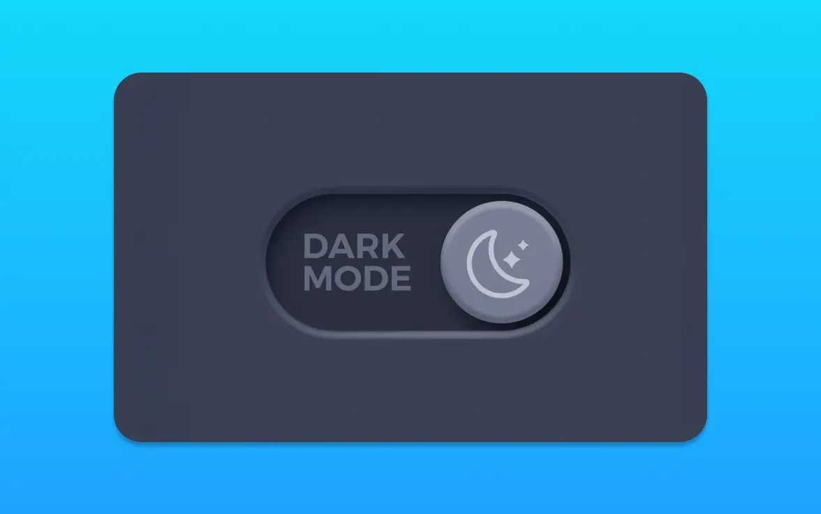
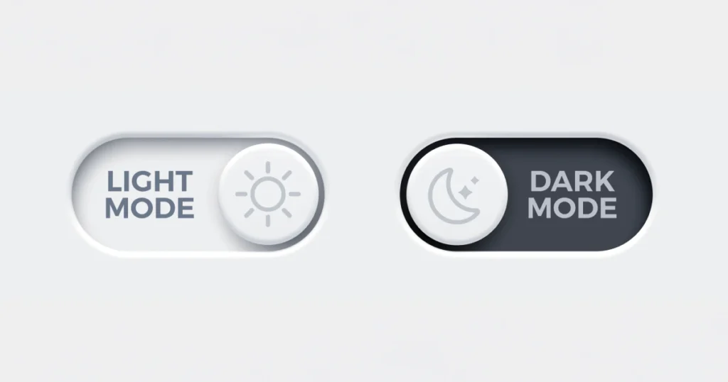
What is Dark Mode?
Dark mode uses a dark background with light-colored text and elements. It’s the opposite of traditional light mode, where the background is light and the text is dark. This setting helps reduce eye strain, mainly in low-light environments.
From a front-end development point of view, setting up dark mode requires careful thought about color schemes, contrast, and visual harmony. It’s not just about changing the background color. It’s about creating a unified visual experience that matches your brand’s identity.
Popularity and User Preference
Dark mode’s popularity has grown, thanks to user preference for less eye strain and better battery life on OLED screens. Users like having the option to switch between light and dark modes. This choice depends on their surroundings and personal preferences.
As a developer, meeting this preference can boost user experience and satisfaction. It’s about giving users choices that make your application or website more enjoyable and accessible.
Benefits of Dark Mode for Users
Dark mode has several benefits for users. It reduces eye strain, mainly in low-light conditions, and can help save battery life on OLED screens. It also offers a more comfortable viewing experience for users with light sensitivity.
By adding dark mode to your web development projects, you can improve user experience, enhance accessibility, and keep up with modern design trends.
Designing for Accessibility and Readability
Creating a dark mode interface is all about making it accessible and easy to read. A good dark mode can make a big difference, making things clearer in dim light. But, it’s important to think about a few key design points.
Let’s look at what makes a dark mode design good. First, the contrast between the background and text is key. This is very important for people with vision problems.
Colour Contrast Considerations
Good colour contrast is vital for clear reading. Designers should aim for a contrast ratio of 4.5:1 for normal text and 3:1 for large text. The Colour Contrast Analyser is a tool that can check if your colours meet these standards.
Choosing colours is also about keeping your design looking good. High contrast is good for reading, but it should also match your brand’s look.
Font Choices for Dark Mode
The right font can make a big difference in dark mode. Sans-serif fonts are best because they’re easy to read. Fonts like Open Sans or Montserrat are great because they’re clear even at small sizes.
Think about the font weight and style too. A medium to bold font can make text easier to read, which is good for long reads.
Tools for Testing Accessibility
There are many tools to check if your dark mode is accessible. The WAVE Web Accessibility Evaluation Tool is one that can spot problems like contrast issues.
Also, getting feedback from users can help a lot. Testing with real users can show you how to make your dark mode better.
By focusing on colour contrast, choosing the right fonts, and using testing tools, you can make a dark mode that looks great and is easy to use. This will make your users happy.
Implementing Dark Mode in Your Web Development Projects
Let’s explore how to add dark mode to your web projects. Developers need to think about back-end and web programming. This ensures a smooth dark mode experience.
CSS Techniques for Dark Mode
CSS is key for dark mode. Using CSS variables (custom properties) is a great method. It makes switching between light and dark easy by just changing the variable values.
You can set up CSS variables for background and text colours. When switching to dark mode, these variables change. Media queries, like `@prefers-color-scheme`, help detect the user’s preference.
Utilizing JavaScript for Toggle Functionality
JavaScript is vital for adding a toggle feature. It lets users switch between light and dark modes. You can do this by adding event listeners to the toggle button.
For example, clicking the dark mode toggle button adds a ‘dark-mode’ class to the body. This class then applies the dark mode styles from your CSS. It makes the experience smooth for users.
Frameworks Supporting Dark Mode
Front-end frameworks like Bootstrap and Tailwind CSS support dark mode. They offer classes and utilities to make it easy to add dark mode.
Bootstrap 5 has a dark mode variant. You can enable it by adding the ‘data-bs-theme’ attribute. Tailwind CSS lets you set up dark mode styles with the ‘dark’ variant in your config file.
User Interface (UI) Elements in Dark Mode
Dark mode is more than a dark background. It’s about making the user experience better through good UI design. When users switch to dark mode, they look for a smooth and useful interface. This interface should make their interaction with your site or app better.
Buttons and Links: Best Practices
Buttons and links are key UI elements that need careful thought in dark mode. To make sure they’re easy to see and use, follow these tips:
- Make sure the button/link stands out against the background.
- Choose colours that match your brand but are clear in dark mode.
- Adding a slight hover effect can make interaction better.
Navigation Bars: Design Tips
Navigation bars are essential for a good user experience, and their design in dark mode matters a lot. Here are some design tips:
- Make sure the navigation bar contrasts well with the background.
- Keep the design of navigation elements consistent.
- Test the navigation bar on different devices, like mobile, for mobile optimisation.
Icons and Graphics: Achieving Balance
Icons and graphics can make your interface look good, but in dark mode, they need to be balanced. Here’s what to consider:
- Adjust the brightness and saturation of icons and graphics for dark mode.
- Choose simple and clear icons to avoid clutter.
- Test your icons and graphics on different backgrounds to ensure they’re visible.
Dark Mode vs. Light Mode: Performance Considerations
The choice between dark mode and light mode affects more than just looks. It impacts how well a website or app works. Understanding dark mode’s effects on user experience and device performance is key.
Energy Efficiency on OLED Screens
Dark mode can save energy, mainly on OLED screens. OLED screens light up pixels individually, using less power for dark pixels. This makes the interface more energy-efficient, which is great in low light.
In the UK, using dark mode can be smart for businesses. It improves user experience and might cut energy use for those with OLED devices.
Visual Fatigue and Eye Strain
Dark mode can be easier on the eyes, reducing brightness. But, it also depends on personal preference and the setting. Proper dark mode use, with good contrast and fonts, helps avoid eye strain.
Impacts on Load Times and User Experience
Dark mode’s effect on load times is worth looking into. While it might not change load times much, it can affect how users feel. A well-optimized site or app works smoothly in any mode.
Improving images, using CSS wisely, and coding well are key. These steps ensure a smooth experience, no matter the mode.
In summary, choosing between dark and light mode involves many factors. We must consider energy use, eye comfort, and how fast the site loads. Making the right choice can improve web projects and make them more responsive.
Styling Components for a Dark Interface
Creating a dark interface is an art that needs a good grasp of colour and contrast. We’ll look into making a dark mode design that looks good and works well.
Colour Palettes That Pop
Choosing the right colours is key for a dark interface. You want colours that go well with the dark background and improve the user’s experience. Here are some tips:
– Keep it simple: Use a few main colours that match your brand.
– Think contrast: Make sure your colours stand out against the dark background.
– Play with shades: Using different shades of a colour can add depth without introducing new colours.
In front-end development, using these colour palettes well can greatly impact your website’s look. For example, CSS variables can help switch between light and dark modes easily.
Backgrounds and Text Combinations
Choosing the right backgrounds and text is key for readability. In a dark interface, finding the right balance is essential:
– Dark backgrounds: Pick a dark background that’s easy on the eyes. Avoid pure black and opt for a deep grey or a colour that matches your brand.
– Text colour: Pick a text colour that contrasts well. While white is common, a light grey or a colour that fits your brand might be better.
– Steer clear of bright colours: Avoid colours that are too bright or neon for backgrounds and text, as they can cause eye strain.
Creating a good dark mode design means trying out different combinations to find what works best for your brand and users.
Maintaining Brand Identity in Dark Mode
One challenge of dark mode design is keeping your brand’s identity. Here are some strategies:
– Adapt your brand colours: Adjust your brand colours to fit a dark setting. You might need to create new versions of your colours.
– Keep design elements consistent: Make sure important design elements, like logos and icons, are updated for dark mode to keep things consistent.
– Test on different devices: Ensure your dark mode design looks good on various devices and platforms. This affects how your brand is seen.
By carefully thinking about these points, you can make a dark mode design that looks great and strengthens your brand. Good front-end development practices will make sure your dark mode is not just pretty but also a smooth part of your website.
Future Trends in Dark Mode Design
The world of dark mode is changing fast. This is thanks to new tech and what users want. We need to look at the new tools and tech that are making dark mode better.
Emerging Technologies and Tools
New tech is helping make dark mode design better. For example, CSS and JavaScript are making it easier to switch to dark mode. This makes using devices smoother. Also, tools for checking if dark mode is easy to read and use are getting better.
Predictions for Dark Mode Usage
Dark mode is becoming more popular. It’s because people want to reduce eye strain and save battery on OLED screens. As more systems and apps use dark mode, it will become even more common.
Integrating User Feedback into Design
Listening to users is key for good dark mode design. By testing and getting feedback, designers can make dark mode better. They might change colors, improve contrast, or tweak the design to fit what users like.
Common Challenges in Dark Mode Design
Dark mode design comes with its own set of challenges. These include keeping the design consistent across different platforms, testing on various displays, and dealing with browser compatibility issues. Let’s look at some practical ways to tackle these problems.
Maintaining Consistency Across Platforms
It’s vital to keep the design consistent across all platforms for a smooth user experience. Designers should use a single design language for both web and mobile apps.
Using CSS variables and modular design helps create themes that work well on all platforms. This is a key part of good web programming.
Testing for Different Display Types
Displays like OLED, LCD, and AMOLED affect how dark mode looks. It’s important to test on many devices to ensure the design looks good everywhere.
Mobile optimization is key here. The design must be flexible for different screen sizes and resolutions. When testing, check how colours appear on different screens and make necessary adjustments.
Navigating Browser Compatibility Issues
Browser compatibility is a big challenge in dark mode design. Different browsers might show dark mode differently, and older browsers might not support some CSS properties.
To deal with these issues, test your design on various browsers and versions. Use feature queries and fallbacks to ensure it works, like CSS media queries to check if a browser supports dark mode.
Best Practices for Launching Dark Mode Features
Launching dark mode features needs careful planning and execution. This is to improve user experience in web development. Let’s look at the key steps to add this feature to your website or app.
User Feedback: The Key to Improvement
Getting user feedback after launch is essential. It shows where you can improve and if your dark mode design meets user needs. Ask users to share their thoughts and ideas.
A/B Testing for Optimal Performance
Using A/B testing strategies lets you compare different dark mode designs. This helps find out what works best for your users. It makes your website or app better for everyone.
Regular Updates and Maintenance
Keeping your dark mode feature updated is key for its success. Always check user feedback and performance data. This helps you make smart choices and keep your projects fresh.
By following these best practices, you can make a great dark mode experience. This will make users happy and help your web development projects succeed.