As a business owner, you know how vital a good logotype is. It’s not just a symbol or name. It shows what your brand stands for and its mission. Let’s look at how famous logotypes helped brands like Nike, Apple, and FedEx succeed.
Good logotypes are key to brand identity and brand strategy. They can make us feel something, share messages, and leave a strong impression. In this article, we’ll explore the best logotypes and what makes them so powerful in the world of branding.
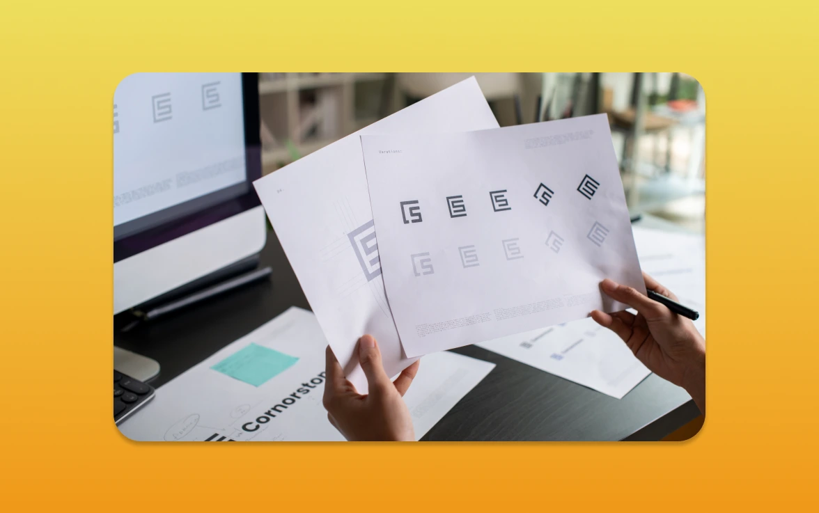
Introduction to Branding in Logotypes
A well-designed logotype is more than just a symbol; it’s the face of a brand. Let’s explore the elements that make a logotype truly great. We’ll see how it contributes to effective brand marketing and brand positioning.
What Makes a Great Logotype?
A great logotype is both functional and beautiful, as noted by Serbay Arda Ayzit. It needs to be simple yet distinctive; memorable yet scalable. Simplicity is key to a logotype’s success, allowing it to be easily recognised and remembered.
Symbolism also plays a big role, adding depth and meaning. This enhances brand recognition. Memorability is another vital aspect, ensuring the logotype stays in the minds of the target audience.
A well-crafted logotype can become synonymous with the brand itself. This fosters brand loyalty and advocacy.

Historical Context of Logotype Design
The evolution of logotype design has been influenced by various historical and cultural factors. Over the years, logotype design has adapted to changing times. It reflects technological advancements, cultural shifts, and artistic movements.
From the early days of branding to the modern digital age, logotypes have shaped brand identities. Understanding the historical context of logotype design offers valuable insights. It helps businesses appreciate the significance of their own brand’s visual identity.
Iconic Logotypes That Shaped Brands
Let’s explore some of the most famous logotypes in history. We’ll see how they helped their brands succeed. Good brand management is key to creating logotypes that stand for a brand’s identity.
The Evolution of the Nike Swoosh
The Nike Swoosh is known worldwide, symbolising speed and athleticism. Its simple design is a success story in brand development. The Swoosh, designed by Carolyn Davidson in 1971, was meant to show motion.
Nike has kept the Swoosh relevant over the years. This shows the power of a well-designed logo in building a brand.
Understanding the Apple Logo’s Simplicity
The Apple logo is famous for its simplicity and elegance. The bitten apple is instantly recognizable, standing for innovation and sophistication. Apple’s brand strategy is all about minimalism, with the logo being a perfect example.
Apple’s logo has changed a lot over the years. The current version is much simpler than its predecessors. This change shows Apple’s focus on sleek design and user-friendly products, strengthening its market position.
Analyzing the Power of Color in Logotypes
Colors are key in logotype design, shaping how people see and feel about a brand. Choosing a color is more than just picking a shade; it’s a big decision. It can greatly affect a brand’s identity and branding strategy.
Different colors can make us feel different things. Blue makes us think of trust and stability. Red makes us feel energetic and passionate. The right color choice is essential for a logotype to send the right message and values.
The Role of Colour Psychology
Colour psychology is important in logotype design. It looks at how colorus affect our feelings and actions. Each colour can trigger different emotions, so picking the right one is key. For example, green is often linked with nature and is used by eco-friendly brands.
When creating a brand identity, knowing how colors affect us is vital. It’s not just about picking a pretty colour. It’s about choosing one that clearly communicates the brand’s message. This needs a deep understanding of the audience and the emotions colours can evoke.
Case Study: The Coca-Cola Red
The Coca-Cola red is a great example of how a colour can become a brand’s identity. This red is instantly recognisable and is meant to make us feel excited and joyful. This strategic colour choice has been a big part of Coca-Cola’s brand strategy, making it a well-known brand worldwide.
The success of Coca-Cola’s red shows the power of colour in logotype design. By picking a colour that connects with their audience, Coca-Cola has made a lasting impression. This case study shows how important colour psychology is in branding decisions.
In conclusion, colour is a vital part of logotype design, affecting a brand’s identity and how people see it. By understanding colour psychology and choosing colours that match their brand, businesses can create logotypes that connect with their audience. This can help improve their brand strategy.
The Flexibility of Modern Logotypes
In today’s digital world, logotypes must be flexible. They are not just for one place anymore. Now, they need to work well on many platforms, like social media and websites.
Let’s see how modern logotypes stay flexible. This helps them keep their brand’s image strong in a fast-changing digital world.
Responsive Design in Branding
Responsive design is key in branding. It lets logotypes change easily for different screens and devices. This means they can grow or shrink without losing their look or clarity.
Good branding needs this flexibility. It makes sure the logotype looks great on any screen size. This helps the brand feel more connected to its audience.
Examples of Adaptive Logotypes
Many brands have made logotypes that change with the digital world. Airbnb is a great example. Their logotype looks good and works well on many platforms.
This shows how important it is for logotypes to be flexible. It helps brands keep a consistent look everywhere. This makes their brand stronger in the market.
In short, modern logotypes need to be flexible. By using responsive design, brands can keep their image strong across different platforms. This is key for good brand marketing.
Cultural Impact of Legendary Logotypes
Iconic logotypes have become more than just brand symbols. They are now a big part of our global culture. These symbols have not only represented brands but have also become a big part of our culture. They help in building and managing brands effectively.
The Global Influence of the Mercedes-Benz Star
The Mercedes-Benz Star is well-known worldwide. It stands for luxury, quality, and innovation in cars. The brand’s success in making itself known is thanks to smart brand development strategies.
The three-pointed star logo has a long history, starting in the early 20th century. It has changed over time to keep up with new ideas and technology. This shows the brand’s dedication to staying ahead in a tough market.
Branding Beyond Borders: The Unicef Emblem
The Unicef Emblem has made a big impact worldwide. It symbolizes hope and help for children everywhere. Unicef’s brand management has made it a trusted name globally.
Unicef’s logo, with a mother and child, is simple yet strong. It shows the organization’s goal to protect and support children’s rights. The logo’s simplicity and the values it stands for have made it popular worldwide, helping in building a strong brand across different cultures.
Minimalism in Logotype Design
Minimalism has changed logotype design a lot. In today’s market, a simple yet effective logotype can make a brand stand out. It can also help a brand get lost in the crowd.
Benefits of Simplistic Designs
Simple designs are more memorable and flexible. A minimalist logotype looks good and works well on different platforms. This is key for keeping a brand’s identity consistent.
Also, a minimalist design helps with brand recognition. By removing extra details, a logotype becomes more unique and easy to remember. This is vital in a busy market where brands compete for attention.
Celebrating the Airbnb Logo
The Airbnb logo is a great example of minimalist design. It looks simple but carries deep meaning, showing a sense of community. Its simple shapes and clean lines make it perfect for many uses, from cards to billboards.
Airbnb’s use of minimalism shows its branding power. With a simple visual identity, Airbnb has built a strong global presence. This strategy has helped the company grow while keeping its brand image unified.
In summary, minimalism in logotype design brings many advantages, like better memorability and versatility. The Airbnb logo shows how a well-designed minimalist logotype can strengthen a brand’s identity.
Timelessness in Logotypes
In the world of brand marketing, some logotypes stand out as timeless. These logos are deeply linked with their brands, boosting recognition. But what makes a logo last forever?
Why Some Logos Never Go Out of Style
Several things make a logotype timeless. First, simplicity is key. Easy-to-spot logos tend to last longer. Also, a good logo shares a brand’s message and values, needing few changes.
Effective brand positioning is also vital. It makes sure the logo connects with people over time. This keeps the brand’s image strong.
Flexibility in design is another important factor. A timeless logo fits well in many places, from cards to billboards. This flexibility keeps the brand’s look consistent everywhere.
The Endurance of the Volkswagen Emblem
The Volkswagen Emblem is a great example of a timeless logo. Introduced in the 1930s, it has barely changed but is instantly known today. Its simple design and strong brand identity have helped Volkswagen keep a consistent image worldwide.
The Emblem’s lasting appeal comes from balancing old and new. Its design has evolved to stay modern while keeping its essence. This balance teaches businesses how to create lasting logos.
The Importance of Typography in Logotypes
Typography is key in logotype design, shaping how people see a brand. The right typeface can make a brand more relatable and easy to remember.
Choosing the right typography for a logotype is more than just looks. It’s a vital part of managing and growing a brand. Different fonts send different messages, and the wrong one can confuse what the brand stands for.
How Font Choice Affects Perception
The type of font used in a logotype greatly affects how a brand is seen. Serif fonts, like Times New Roman, suggest tradition and professionalism. Sans-serif fonts, like Arial, are seen as modern and simple.
Here’s how different fonts can change how people see a brand:
- Serif fonts (e.g., Times New Roman) are often seen as classic and trustworthy.
- Sans-serif fonts (e.g., Arial) are perceived as modern and sleek.
- Script fonts can add an element of elegance or creativity.
Notable Typography Examples: Google and HBO
Google and HBO show how good typography can make a brand stand out. Google’s custom sans-serif font makes it seem friendly and welcoming.
HBO’s logotype, with its bold and unique font, shows high quality and exclusivity. These examples show how careful typography can boost a brand’s image and identity.
Innovative Logotype Trends
Innovative logotype design is leading the way in branding. The logotype, a key part of a brand’s identity, is changing to fit the digital world. Let’s explore the trends that are shaping logotype design’s future.
Hybrid Logotypes: A New Approach
Hybrid logotypes are a big change in design. They mix wordmarks and pictorial marks, making branding more flexible. This is great for today’s digital world, where brands need to work on many platforms.
Hybrid logotypes are good at sharing complex brand messages simply. For example, they can show a brand’s name and values at the same time. This makes them a strong choice for brands wanting to boost their identity.
The Growth of Animated Logos
Animated logos are becoming more popular in logotype design. They add movement to logos, making them more engaging. Animated logos work well online, like on websites and social media, to grab attention.
Animated logos also let brands show their personality and values in a fun way. For example, a playful animated logo can show a brand is fun and friendly. A more calm animation can suggest elegance and sophistication.
Best Practices for Implementing Animated Logos
When using animated logos, keep a few things in mind. First, the animation should be subtle and not take away from the brand message. Second, think about where the logo will be seen. A website logo might not be right for TV. Lastly, the animation should match the brand’s overall look.
By using new logotype trends like hybrid and animated logos, businesses can stay ahead. They can create exciting brand experiences that connect with their audience.
Lessons from the Best Logotypes
Let’s look at the lessons from the world’s top logotypes. These can help improve your brand’s marketing. Understanding what makes these logotypes great can teach us a lot about marketing and positioning.
Key Takeaways for Businesses
Iconic logotypes show us several key points. First, simplicity is key. A simple design sticks in your mind and is easy to spot. Think of the Nike swoosh or the Apple logo.
Adaptability is another must. With digital media, your logotype must work on many platforms. It should look good in all sizes and resolutions.
Designing with strategy is also critical. Your logotype should show your brand’s values and personality. For example, the Coca-Cola logo represents the brand’s heritage and values. Knowing your brand’s market position helps create a logotype that speaks to your audience.
Common Mistakes to Avoid
Businesses often make mistakes when creating logotypes. One big error is making the design too complicated. A busy logotype is hard to remember.
Another mistake is not thinking about adaptability. A logotype that looks good online might not work for social media or merchandise. It’s important to make sure your logotype works everywhere.
Ignoring typography is another mistake. The font of your logotype greatly affects how people see your brand. Choose a font that fits your brand’s personality and is easy to read in different places.
To avoid these mistakes, focus on simplicity, adaptability, and strategic design. This way, you can create a logotype that boosts your brand’s marketing and recognition.
Conclusion: The Everlasting Impact of Logotypes
Effective brand management is key for businesses, and logotypes are vital. A well-designed logotype is essential for brand recognition and identity.
Let’s look at the main points about logotypes. A good logotype helps a brand stand out and is easily recognised by consumers. The Coca-Cola and Nike logos are great examples of how logotype design can build a brand.
In brand building, a logotype shows a company’s values and mission. It’s more than a symbol; it’s a key to connect with people emotionally. By understanding logotypes, businesses can make better choices for their brand management.
As we wrap up, it’s clear that logotypes have a lasting effect on branding. Using effective logotype design in brand development can improve a brand’s identity and help it grow.