In plain terms, UX strategy links what you want to achieve with clear ux design choices. It covers every touchpoint — from the first page on your website to in-product steps. Good strategy helps users move faster, sign up more often and come back.
This short guide shows what you will learn: research, the design process, testing, accessibility and tools. I explain how to put these into action without jargon. You’ll get straight ideas you can brief, prioritise and measure.
Think commercial results: fewer drop-offs, smoother journeys and better conversion. That means your design work supports growth, not just looks. I’ll focus on real users, removing friction and improving based on evidence — so your team’s work pays off.
UX strategy and user experience: what you’re really designing
Good strategy is less about pixels and more about the path people take to get value. I define user experience as the total of what users think, feel and do across every interaction with your brand — before, during and after they use your product service.
Defining user experience across every touchpoint
Every touchpoint matters: ads, landing pages, enquiry forms, checkout, onboarding emails, support pages and in-app prompts all contribute to the experience. Small changes at any step can lift conversion or quietly lose sales.
The three pillars: look, feel and usability
Assess your interface on three fronts. Look builds trust — it must feel right for your audience. Feel creates confidence and ease. Usability is the cornerstone: if users cannot complete tasks quickly, nothing else saves the experience.
What “good user experience” means in practice
Good experience lets users complete key tasks fast, avoid errors and feel in control. Strategically, you are not crafting screens; you are designing outcomes, behaviours and the path people take to value.

Why UX design matters for UK businesses
Strong product journeys make the difference between a one-off visit and a loyal customer. I’ll show how small fixes create a commercial chain reaction that grows revenue and cuts waste.
How UX influences adoption, retention and loyalty
Better user experience reduces friction. That raises adoption and keeps people coming back.
When users reach value quickly they convert more often. Repeat use builds loyalty and referrals.
Conversion, churn and the cost of friction
Friction shows up as confusing pricing pages, slow mobile forms or unclear next steps. These problems cost sales and raise churn.
Fixing specific bottlenecks often lifts conversion rates faster than marketing spend. It also lowers support costs.
Aligning user needs with business goals
You do not have to choose between what users want and business needs. I recommend clear metrics: task success, time to value and conversion per funnel step.
Use simple tests and customer evidence to prioritise work. Stakeholders back fixes when outcomes and numbers are clear.
UX vs UI: clearing up the confusion
Let’s start with a simple frame: screens are one part of a wider journey. I’ll show where the visual layer ends and the full user experience begins.
User interface as part of the wider picture
Think of the user interface as what people see: layout, typography, colour and buttons. A clear brief names the key screens, CTAs and visual hierarchy you expect.
Where visuals end and user flows begin
User experience covers how the product works, how people move through it, and whether they reach value without friction. A smooth user flow maps those steps before the first pixel is finalised.
The hand-off matters. Visual choices can help or hurt a journey. Beautiful screens that add steps or hide actions still fail users.
I use a simple mental model for teams: the interface is a layer; user experience is the full journey — what happens before, during and after the screen. That clarity helps designers avoid debates that stall progress.
What makes a good user experience
A good user experience helps people reach their goals quickly and without fuss. I define it as helping users complete tasks with minimal friction while still meeting your business aims.
User-first thinking (and what gets in the way)
Think of “user-first” as a filter for every choice. Ask: does this help a real user or serve an internal preference?
Common blockers are politics, feature overload and unchecked assumptions. I favour small tests and evidence to settle debates fast.
Simplicity, hierarchy and consistency across channels
Keep headings clear, menus predictable and CTAs consistent across site, email and support. This reduces confusion and speeds journeys.
Hierarchy guides attention — make priority actions obvious and secondary ones subtle.
Functionality before aesthetics, without ignoring aesthetics
Ship the thing that works, then polish. Functionality first improves usability; careful styling builds trust and reduces doubt.
Using familiar patterns to reduce the learning curve
Standard icons, expected checkout steps and common layouts help returning users act without thinking. Familiar patterns cut training time.
Quick self-audit checklist
– Can a new user complete your core task in under three steps?
– Are CTAs clear and consistent across pages?
– Do visual choices support, not obscure, key actions?
– Where do users drop off? Check analytics and watch sessions for hidden issues.
The UX design process as an iterative loop
I frame the work as a loop: think, make, check. That keeps teams honest and focused on outcomes rather than opinions.
Lean UX framing: think, make, check
Think: gather feedback, review usage data and scan competitors for quick insights. Pick a clear hypothesis to test next.
Make: build a small change or prototype. Keep scope tight so releases are fast and affordable.
Check: run surveys, A/B tests or multivariate testing. Use results to confirm assumptions or to pivot fast.
Continuous improvement after launch
Launch is the start, not the finish. Monitor behaviour, fix obvious friction and prioritise work by impact and cost.
Use product metrics and session insight to choose what to build next. That approach helps you plan releases within realistic budgets and timelines.
Testing early and often reduces risk. It keeps the team learning and the product improving in small, measurable steps.
Research and understanding users before you design
Before you sketch a screen, learn which tasks frustrate your customers today. I start with focused research that uncovers real problems you can fix this quarter.
User research: pain points, goals, blockers and behaviours
I talk to a handful of real users, watch sessions and ask task-based questions. This uncovers pain points, goals and the blockers that stop people finishing key steps.
Keep interviews short and goal-focused. Capture behaviours you can measure and prioritise fixes by impact.
Market and competitor research to spot opportunities
Scan competitors and market moves to find gaps. Often the chance to differentiate is simple: faster onboarding, clearer pricing or less cluttered navigation.
Historical analysis: learning from what your product data already says
Use product metrics to find drop-offs, repeated support tickets and high-friction steps. Data highlights where to test first.
Personas and scenarios that keep teams aligned
Turn research into short personas and scenarios so marketing, sales and product solve the same needs. Keep them one page.
Example persona: “Sophie, small retailer — needs quick stock updates, avoids long forms, values clear pricing.” Use this format in a workshop without a research team.
Information architecture and content structure that helps users find their way
A well-ordered site stops people getting lost and starts conversions. I treat information architecture as the shape of your website and content — the skeleton that makes pages useful without a full redesign.
Navigation that grounds people and prevents getting lost
Grounding means clear menus, sensible labels, visible breadcrumbs and a consistent placement of key links. These simple choices show users where they are and how to go back.
Design choices here are low effort and high impact. Better navigation improves findability and reduces support queries.
Card sorting and classification to shape IA
Run a lightweight card sort with real customers. Ask them to group topics and name groups. This reveals how people think about your content and interaction paths.
Document your IA decisions so developers and content owners can implement them without guesswork. Include a simple map, naming rules and example page types. That way your structure supports non-linear journeys and business goals: fewer drop-offs, more enquiries and faster task completion.
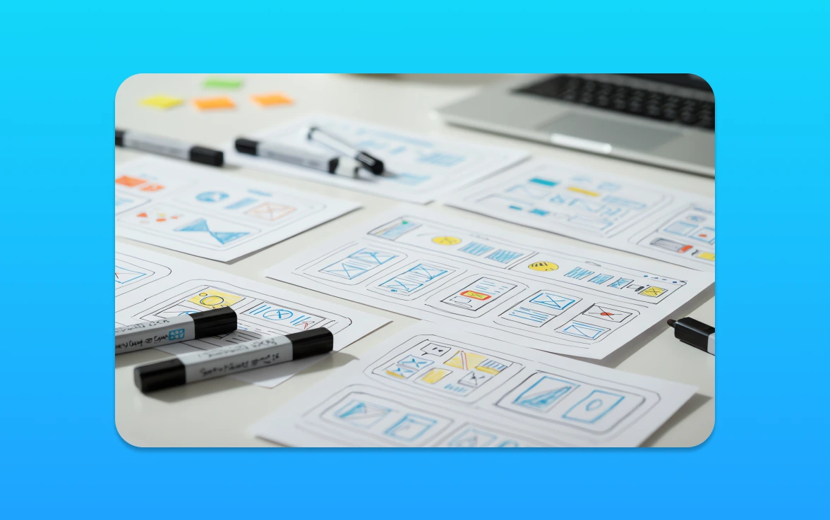
Wireframing and prototyping in the design process
A quick wireframe can save weeks of rebuilds and clarify the next step. I use low-fidelity sketches to test whether core ideas work before we polish visuals or write code.
Wireframes as low-risk ways to test ideas
Wireframes reduce risk by proving structure and intent early. They focus on hierarchy, copy placement and key actions rather than pixel-perfect visuals.
Keep them pragmatic for the project: show the main task, available choices and where people might get stuck. That makes stakeholder feedback concrete and fast.
Prototypes and MVP thinking for faster learning
Build the minimum that proves the experience. A prototype that mimics core flows gives real users something tangible to test.
Think in terms of products and service features you can validate quickly. Early feedback prevents costly rework and speeds delivery to market.
User flows and journey mapping for websites, apps and services
Map the ideal user flow, then compare it to actual behaviour. Capture steps, decisions, failure points and moments that reassure users.
Use journey maps to find dead ends—missing confirmations, vague next steps or broken expectations—and fix them before full build. Better pre-build validation means smoother handovers to developers and fewer expensive changes later.
Usability testing and user testing: methods that uncover friction
Testing reveals the hidden steps that stop customers from finishing a task. I separate practical checks from broader behavioural study so you pick the right method fast.
Moderated and unmoderated usability testing
Usability testing asks one clear question: can people complete a task? Moderated sessions give rich, real-time insight. You can follow up and probe why someone hesitated.
Unmoderated testing is faster and cheaper. It suits simple flows and larger samples. Use it when speed and volume matter.
A/B testing and multivariate testing for evidence-led decisions
A/B and multivariate testing use live traffic to settle copy, layout or funnel disputes. Run these when you need quantitative data to back a change.
Keep experiments focused and run them long enough to collect meaningful results.
Behaviour analytics: heatmaps and session replays
Heatmaps show attention and scrolling patterns. Session replays reveal misclicks, hesitation and rage clicks. Together they point to concrete fixes.
Surveys and interviews to capture the voice of the user
Quantitative data tells you what happened. Short surveys and interviews tell you why. Combine the two to form clear hypotheses for further testing.
Prioritise findings by impact and effort. Fix blockers that stop conversions first, then address smaller annoyances. Use the right tools, gather clean data and act fast—this is the most reliable way to reduce friction and improve outcomes for your users.
Designing for multi-device experiences and accessibility
People move between phone, tablet and laptop during one purchase — your product must move with them.
Consistency across mobile, tablet and desktop
Consistency means the same navigation patterns, content hierarchy and key actions across devices. Keep core actions visible and predictable so users know what to expect.
Respect constraints. For example, simplify menus on small screens and preserve labels and task flow so the experience feels continuous.
Accessibility as a baseline, not an add-on
Accessibility is about making your website and product usable by people with disabilities. If people cannot use your offering, you lose customers and face avoidable risk.
Start with practical checks: contrast, visible focus states, clear labels, keyboard support and plain language. These fixes raise usability for everyone.
Build accessibility into your workflow. Add simple automated checks, include manual keyboard tests in every sprint and review copy for readability. Small, ongoing work stops costly retrofits and keeps users moving toward value.
Roles, responsibilities and how UX teams work
Knowing who does what is the fastest route from idea to a tested prototype. I’ll map the practical roles you need so hiring, briefing or working together feels simple and useful.
What a designer does day to day
A typical day mixes research, sketching and rapid prototyping. I talk to users, turn findings into wireframes and run quick tests to check assumptions.
The designer translates business goals into flows and clickable mocks. They measure results, refine iterations and communicate reasons to stakeholders so the project stays focused.
Related roles and where they fit
Researchers dig into behaviour and evidence. Interaction specialists focus on micro-moments and controls. Service people map end-to-end journeys beyond screens. Product leads set priorities and trade-offs.
Together, these designers bring complementary skills. Pick roles based on your stage: one multi-skilled designer for small projects, specialists for larger programmes.
Working effectively with developers and stakeholders
Align early. Let developers review prototypes and estimate effort. Agree success metrics with stakeholders before work starts.
Avoid bottlenecks with lightweight docs, clear decision logs and short show-and-tells tied to outcomes. When teams share user insight, the whole product improves faster — that collaboration is the biggest growth lever you have.
Core UX skills that make an impact
The right mix of skills lifts teams from good ideas to measurable results. I focus on capabilities that move the needle for small businesses — not personal taste or trends.
Empathy and curiosity: getting inside users’ intent
Watch what people actually do. Ask clear, task-based questions and listen for intent, not opinions.
These habits cut assumptions and reveal where the process breaks down.
Thoroughness: research, metrics and credibility
Good researchers link findings to metrics. Tie qualitative insight to conversion, time to value and support data so decisions are defensible.
This builds credibility with stakeholders and speeds approval for fixes.
Communication and collaboration in real projects
A strong designer explains trade-offs and keeps developers unblocked. Regular demos and short decision notes save weeks of rework.
Work with people, share evidence and agree outcomes early.
Creativity and iterative problem solving
Generate options, test quickly and improve. Iteration beats a perfect first draft every time.
Practical technical skills: analysis, prototyping and basic coding awareness
Basic analysis and rapid prototyping reduce hand-off friction. A bit of coding literacy helps conversations with engineers and speeds delivery.
If gaps exist, a short practical course will upskill teams fast and keep projects moving.
Tools like prototyping software, analytics and research platforms
Pick tools that answer the question you face next, not the one you imagined weeks ago.
Choosing tools without overload
Start with essentials: one prototyping app, one analytics source and a basic survey tool. This keeps costs low and learning fast.
I choose tools based on the decision they enable — not on features. If a tool does not help me prioritise fixes, it leaves the stack.
Examples of wireframing and prototyping tools
Use a fast wireframe app for early ideas and a collaborative prototyping tool for interactive flows and hand-off. Choose tools that export specs or link to developer tasks.
Testing and insight tools to support usability and decision-making
Combine heatmaps, session replays, surveys and A/B experimentation. These research and analysis methods answer different questions: where people hesitate, why they leave, and which change improves conversion.
Keep governance simple: name files clearly, store a single source of truth and set access rules. That way designers use outputs to turn insights into prioritized action, not another dashboard nobody reads.
Putting UX strategy into action on your next project
Begin every project with a clear mission statement and one measurable goal. State the objective, list constraints (time, budget, tech) and name the success metrics you will track.
Defining objectives, constraints and success metrics
Keep goals specific: conversion uplift, time to value or task completion rate. Tie each goal to a numeric target and a deadline so everyone knows what “better” means.
Mapping the ideal user flow, then spotting deviations
Map the shortest path to value for a typical user. Then use analytics and session data to spot where users deviate and why.
Prioritising fixes and improvements based on evidence
Prioritise by impact versus effort. Use severity of friction and alignment to business goals to order work. Base choices on testing and data, not opinion.
Launching safely with beta releases and staged roll-outs
Release in stages: small cohorts, A/B tests and beta programmes. Monitor conversion, errors and qualitative feedback. Use findings to iterate before a full rollout.
Document decisions, hypotheses and success measures so the process is repeatable across future projects and product teams.
Taking your UX forward with confidence
Make evidence your north star and improvements will compound over time.
Start with one key user journey. Research real users, map the path, and simplify the steps that cause the most drop-off.
Measure before and after. Run lightweight user testing or A/B testing, track conversions and support tickets, then act on the data.
Quick wins often include clearer labels, fewer form fields and faster page flows. Deeper fixes need more research and changes to the product or interface.
Next steps: pick one journey, set a success metric, run a short test, implement the change, and measure again.
If you want help diagnosing friction or prioritising a roadmap, I can work with your team or bring in a designer to accelerate results.