As a business owner, having a strong brand is key in today’s digital world. Typography is a big part of this. It helps create a visual identity that stands out.
Good visual communication is vital for sharing your brand’s message and values. Your typography choice is not just about fonts. It’s a key part of your brand identity. Let’s look at how new typography trends are shaping modern branding and what it means for your business.
Knowing these typography trends helps you make choices that can boost your brand and help it grow.
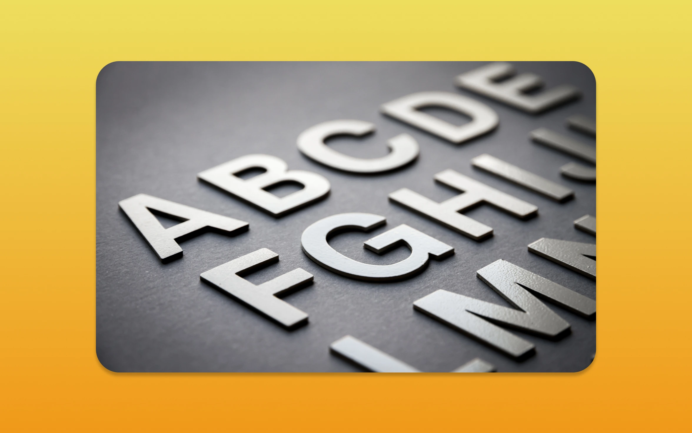
The Importance of Typography in Branding
In branding, typography is key. It can make or break a brand’s identity. Fonts and typography show a brand’s message, personality, and values. This makes it vital in graphic design.
Why Typography Matters
Typography affects how people see and interact with a brand. The right fonts can stir emotions, simplify complex messages, and leave a strong impression. For example, serif fonts like Times New Roman suggest tradition and professionalism. Sans-serif fonts, like Arial, are modern and sleek.
- Serif fonts convey tradition and professionalism.
- Sans-serif fonts are modern and sleek.
- Script fonts can add an elegant or playful touch.
Creating Brand Identity through Fonts
Fonts are essential in creating brand identity. The right typography helps businesses stand out and maintain a consistent look across all marketing. Brands like Coca-Cola and McDonald’s use unique fonts that are instantly recognizable.
- Select fonts that align with your brand’s personality.
- Ensure consistency across all marketing materials.
- Consider custom typography for a unique identity.
Typography as a Communication Tool
Typography is more than just looks; it’s a powerful way to communicate. The presentation of text can greatly affect how easily it’s read and understood. Clear, easy-to-read typography ensures your message is clear, improving user experience and engagement.
- Bold typography can be used to draw attention.
- Italic typography can add emphasis or convey a different tone.
- Clear, legible typography improves readability.
By understanding typography’s role in branding, businesses can boost their identity, improve communication, and drive growth.

Current Typography Trends to Watch
Typography trends are changing how brands present themselves. The right typography can greatly affect how people see a brand. Let’s look at the trends that are shaping the industry.
Bold Fonts for Bold Statements
Bold fonts help brands make a strong impression. They’re great for headings, adding confidence and strength. For example, Netflix and Spotify use bold fonts to stand out.
- Bold fonts make headlines pop.
- They bring a modern and sophisticated look to a brand.
- Brands show courage and innovation with bold fonts.
Minimalist Typography in Branding
Minimalist typography is all about simplicity. It uses clean, sans-serif fonts for elegance and sophistication. Apple and Google have successfully used this in their branding.
It’s not just about looks. Minimalist typography improves readability and user experience. It helps brands share their message clearly.
Vintage Font Styles Make a Comeback
Vintage fonts are back, adding nostalgia and character to brands. They often have a unique, distressed look. This adds warmth and personality. Coca-Cola and Levi’s use vintage fonts to show heritage and tradition.
The return of vintage fonts shows the value of mixing modern and timeless. Using vintage elements creates a rich, engaging visual story.
Custom Typography: A Unique Touch
Branding is getting more competitive, and custom typography is key to standing out. In a busy market, companies look for ways to make a mark. They want to leave a lasting impression on their audience.
Advantages of Bespoke Fonts
Custom fonts let brands show their unique side. By using custom typography, businesses can keep their brand look consistent everywhere. Here are the main benefits:
- Enhanced brand recognition through a unique visual identity
- Improved brand consistency across various platforms
- The ability to convey a brand’s personality and values more effectively
Examples of Brands Using Custom Typography
Many brands have used custom typography to boost their identity. For example, Spotify and Airbnb have created fonts that are instantly recognizable. These fonts match their brand messages perfectly.
These examples show how custom typography can change the game in branding. It helps businesses connect with their audience and build a strong presence in the market.
The Role of Colour in Typography
Using colour in typography can greatly change how a brand is seen. Colour is more than just looks; it’s key to emotions, messages, and lasting impressions.
Understanding Color Psychology
Color psychology is key in choosing fonts. Different colors can make people feel different ways. For example, blue is trusted and stable, while red is energetic and urgent. Let’s look at some color psychology in typography:
- Emotional Connection: Colors can connect with people, making a brand more relatable.
- Brand Identity: Using the same colors can make a brand more recognizable.
- Contrast and Legibility: The right color contrast makes text easy to read for everyone.
Effective Color Combinations
Choosing the right color combinations is key for branding. The right colors can make your typography look better and strengthen your message. Here are some tips for picking good color combinations:
- Stick to a few colors to keep things simple and avoid mess.
- Make sure the text and background have enough contrast for easy reading.
- Think about how your colors will make your audience feel.
By understanding color in typography and using color psychology, you can make a strong visual identity for your brand. This will connect with your audience.
Accessibility in Typography
Accessible typography is now a must for brands wanting to reach out to everyone. It’s key for making digital experiences welcoming to all. The role of typography in accessibility is huge.
Readability and Legibility Matter
It’s vital that your text is easy to read and understand. Readability deals with how simple it is to grasp the text. This includes the size of the font, the space between lines, and how long paragraphs are. Legibility is about how clear the font is, making sure each letter is easy to spot.
- Choose fonts with clear letterforms and adequate spacing.
- Use font sizes that are comfortable for reading, typically at least 16px for body text.
- Ensure sufficient contrast between the text and background.
Accessible Font Choices
Picking the right fonts is essential for accessible typography. Fonts that are too fancy or complex can be hard to read. This is true for people with dyslexia or other reading issues. Simple, sans-serif fonts like Arial, Helvetica, or Open Sans are better for reading.
Think about how your font choices make people feel. Fonts can set a mood or tone, affecting how your message is seen.
By focusing on accessible typography, you improve the user experience. You also make sure your brand’s message gets across to everyone, no matter their abilities.
Incorporating Multi-Device Typography
In today’s world, making sure your text looks good on all devices is key. Most people use different devices to view content. So, having flexible text is essential for a smooth experience.
Responsive Typography for Mobile Users
Responsive typography is more than just changing font sizes. It’s about making sure your text looks good on all devices. For mobile users, it means your text should be easy to read on small screens.
- Use relative units like ’em’ or ‘rem’ for font sizes to ensure they scale well.
- Choose font families that work well on digital screens and are available on all devices.
- Check how your text looks on various mobile devices to make sure it’s easy to read.
Designing for Different Screen Sizes
Designing for different screens needs a good understanding of how your text will look. It’s not just about making fonts bigger or smaller. It’s about creating a beautiful visual experience.
When designing for different screen sizes, consider the following:
- Know the viewing distances and environments for each device.
- Adjust font sizes and line heights to make sure it’s easy to read.
- Use CSS media queries to change styles based on screen size.
By using these strategies, you can make sure your text looks great on all devices. This will improve the user experience across devices.
The Rise of Variable Fonts
Variable fonts are changing how we use typography in branding. They let one font file act like many, giving us new ways to customise. This is a big step forward.
Looking into variable fonts, we see many benefits for branding. Let’s dive into the main advantages.
Flexibility and Customisation
Variable fonts stand out for their flexibility. Designers can tweak font features like weight, width, and slant. This level of customisation is unmatched by traditional fonts.
- Improved responsiveness: Variable fonts adjust well to different screen sizes and devices.
- Enhanced creativity: Designers can try many typography options without needing lots of fonts.
- Reduced file size: Variable fonts are often smaller than traditional fonts, despite their many variations.
Practical Application
Using variable fonts in your branding is easy. Here’s how to start:
- Find a variable font that fits your brand’s typography needs. There are many online resources.
- Use CSS to adjust the font’s attributes, like weight and width, for the look you want.
- Check your variable font on various devices and browsers to make sure it works well everywhere.
By using variable fonts, you can improve your brand’s typography. This makes your brand look better and keeps you ahead in branding and graphic design.
Emotional Impact of Typography
Typography is more than just words on a page. It can stir emotions and shape how we see a brand. By picking the right fonts, you can connect deeply with your audience.
Fonts that Evoke Feelings
Fonts can make us feel different ways. Serif fonts feel traditional and reliable. Sans-serif fonts are modern and simple. Let’s look at some examples:
- Script Fonts: These fonts add elegance and sophistication, perfect for luxury brands.
- Bold Fonts: Bold fonts show confidence and strength, great for brands that want to stand out.
- Vintage Fonts: Vintage fonts bring a sense of nostalgia and warmth, ideal for brands with a retro feel.
When picking fonts, think about the emotions you want to create. Make sure your typography matches your brand’s personality and message.
Aligning Typography with Brand Messaging
Choosing the right font is key, but it’s also about matching your brand’s message. Here are some tips:
- Understand Your Brand’s Personality: Know if your brand is formal or friendly, modern or traditional.
- Consider Your Audience: Think about what emotions you want to share with your audience. Your font should speak to them.
- Consistency is Key: Use the same typography everywhere, from your website to marketing materials.
By picking typography that fits your brand’s message, you can make a stronger emotional connection with your audience.
Typography Trends in Digital Marketing
In today’s digital world, typography is key to your brand’s online look. It’s vital to grasp how it can boost your branding and engage people.
Let’s explore how typography shapes digital marketing. This includes social media, website design, and SEO.
Using Typography in Social Media Branding
Social media is all about visuals, and typography is central to making content stand out. Here are a few tips for using typography in social media branding:
- Choose bold, easy-to-read fonts to catch attention and share your brand’s message.
- Try out different font styles and colors to make your brand’s look unique.
- Keep your typography consistent across all platforms to strengthen your brand’s identity.
Effective typography in social media can boost engagement and send more people to your website.
Typography for Website Design and SEO
Typography is also critical in website design, affecting both user experience and SEO. Here are some important points to consider:
- Pick fonts that are clear and work well on all devices, like desktops, tablets, and phones.
- Use header tags (H1, H2, H3, etc.) to structure your content and highlight important phrases for SEO.
- Typography helps create a visual order, guiding users through your site and improving their experience.
By focusing on both looks and function, you can make a website that’s not only attractive but also ranks well in search engines.
In summary, typography is essential in digital marketing. It impacts social media, website design, and SEO. By understanding its role and applying best practices, you can enhance your brand’s online image and see real growth.
Combining Typography with Imagery
Branding often needs the perfect mix of typography and imagery. When done right, this mix makes a brand’s message stand out. It grabs the audience’s attention.
Creating Visual Harmony
Visual harmony happens when typography and imagery match well. This makes the brand’s message clear and appealing. Choosing the right fonts, colors, and image layouts is key.
- Select fonts that complement the imagery and enhance the overall visual identity.
- Use color schemes that are consistent across both typography and imagery to create a cohesive look.
- Balance text and images in a way that guides the viewer’s attention effectively.
Case Studies of Successful Integrations
Many brands have mixed typography and imagery well. For example, a fashion brand might use bold fonts with high-quality images. This shows luxury and style.
Here are a few examples:
- A well-known coffee chain uses a unique font in their ads. They pair it with images of coffee cups and cozy spots. This creates a welcoming vibe.
- A tech company might use simple fonts with futuristic images. This shows innovation and the latest tech.
Looking at these examples, we see the importance of balance. The right mix of typography and imagery is essential. It must match the brand’s message and identity.
Measuring Typography Effectiveness
It’s key to check if your typography fits your brand’s message and goals. This helps improve your brand’s look and how users feel when they see it.
When measuring typography, think about how well your fonts share your brand’s message. Also, consider how they affect how users interact with your content.
Tools for Tracking Typography Impact
There are tools to help you see how your typography is doing. These include:
- Google Analytics: To look at how users act and engage with your typography.
- Heatmap tools: Like Crazy Egg, to see where users click and look on your site.
- A/B testing tools: Such as Optimizely, to see how different fonts affect users.
Using these tools, you can learn a lot about your typography. You can find out what works and what doesn’t.
Gathering Feedback on Font Choices
It’s important to get feedback on your font choices. You can do this by:
- User surveys: Asking your audience what they think of your fonts.
- Focus groups: Getting detailed feedback on your font choices.
- Social media polls: Asking your followers about different font options.
By listening to your audience, you can make your typography better. This will help your brand look its best and feel right to your users.
Future Typography Trends to Anticipate
Looking ahead, typography trends will keep changing. This is thanks to new tech and how people use it. Let’s check out some new styles that will shape typography.
Emerging Styles
New trends are coming, with bold, futuristic fonts. They mix digital and handmade looks. These Creative Trends are eye-catching and flexible for different brands.
Staying Ahead
To lead in typography, keep up with the latest Future Typography Trends and Upcoming Styles. This way, your brand stays ahead in visual communication. It will engage your audience and help your business grow.